Net-a-Porter’s top-performing editorial of Q3 2025 was a single-topic feature. The topic: how to dress head-to-toe in one color. It generated 4.1 million page views. It was shared 340,000 times. Readers didn’t just read it. They screenshotted it. They saved it. They came back to it. Monochromatic dressing looks effortless. It is not effortless. There are rules. When you follow them, the result is the most polished look in the room. When you ignore them, you look like a paint swatch.
This guide covers both outcomes.
Why Monochromatic Dressing Works
The brain processes a single-color look differently. Fact.
One unbroken color line makes the body appear longer. It makes silhouettes read cleaner. It removes visual competition between top and bottom. The eye travels straight up and down — no interruptions, no breaks. That vertical line is deeply flattering across every body type.
There’s a second reason. Tonal dressing signals intention. It reads deliberate. It communicates that you made a conscious choice. People notice it. They can’t always explain why. The answer is visual coherence. One color palette creates it immediately.
This is why Zara’s tonal campaign images consistently outperform multicolor ones on social media. It’s why editorial photographers default to monochrome when they want a shot to feel authoritative. The principle is simple. Simplicity creates impact.
Start with your most-worn neutral. Build one complete tonal look around it before experimenting with color. Get the technique right in a safe color zone first.
The Three Rules That Make It Work
Skip any of these. The look falls apart.
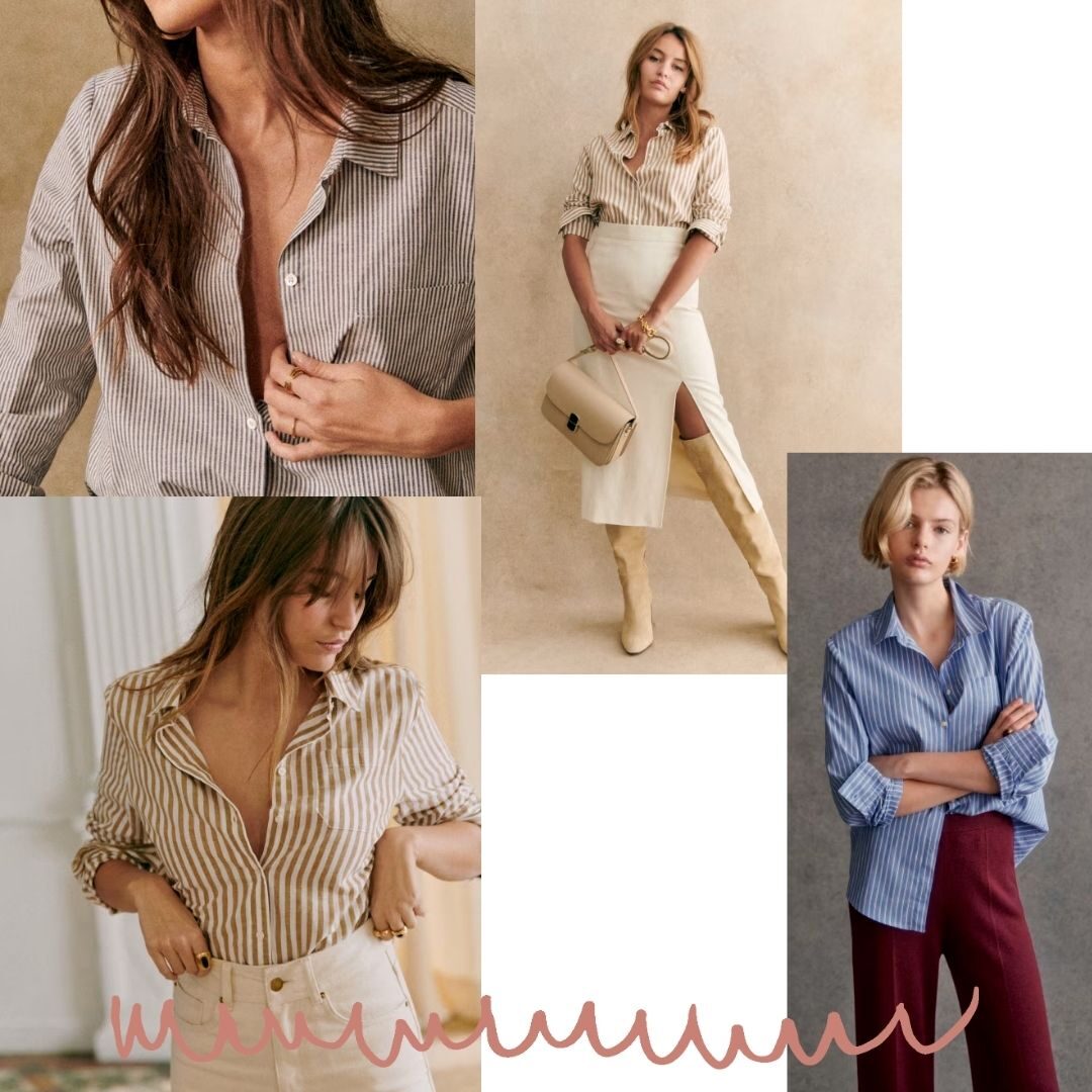
Rule one: Vary the texture. This is non-negotiable. A head-to-toe beige look in identical fabric reads flat. The same beige in three textures — matte linen, shiny satin, soft suede — reads expensive. Texture creates the visual interest that color contrast usually provides. Without it, you are wearing a uniform, not an outfit.
Rule two: Vary the shade. Pure matching is harder than tonal dressing. And less interesting. Work within a two-to-three shade range. Ivory on top, warm ecru in the middle, camel at the bottom. The shades connect. They don’t match. That difference matters more than most people realize.
Rule three: Break with footwear or a bag. One deliberate contrast point grounds the entire look. It signals that the monochrome is intentional — not the result of grabbing whatever matched. A tan shoe in a white look. A black bag in a grey look. One break. Not two.
If the full monochromatic look feels like too much at first, start with a two-piece tonal combination. Same color, different pieces, different textures. Build from there.
Three Complete Outfits to Copy Right Now
These are fully built looks. Use them exactly or adjust from here.
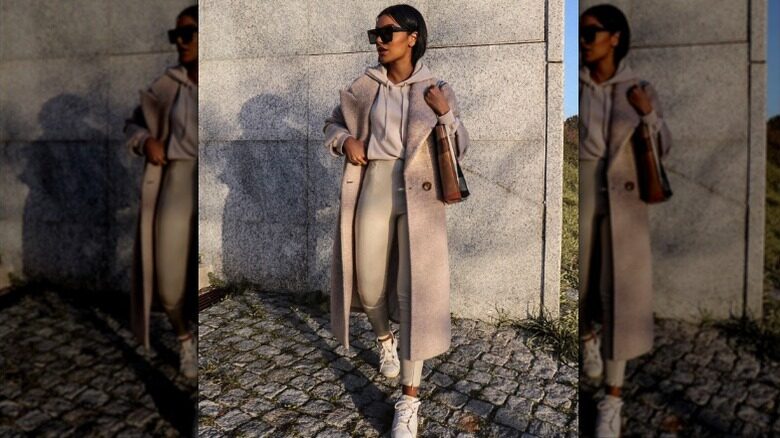
Look one: The Camel Column.
Start with a ribbed camel turtleneck. Add high-waisted wide-leg trousers in a slightly deeper tan. A suede shoulder bag in warm cognac. Flat leather loafers in dark camel. This look works for office, lunch, and gallery openings. The key: the suede bag adds texture. The slightly darker shoe grounds the silhouette at the base.
Approximate budget: $180–$400. Arket does this turtleneck exceptionally well at $95. COS carries the trouser at $130.
Look two: The White Study.
An oversized poplin shirt in bright white. Tailored wide-leg trousers in off-white or cream. A structured white leather bag — minimal hardware. White pointed-toe flats or low heels. Do not use pure white shoes. They flatten the look. Ivory or bone keeps the tonal range alive.
The one contrast piece: a thin gold necklace. Metal doesn’t count as a color break. It counts as a texture break. Use it accordingly.
This look photographs exceptionally well in natural outdoor light. Take note.
Look three: The Slate Stack.
This is the most directional of the three. A charcoal grey oversized blazer. A mid-grey silk slip dress beneath it. Charcoal ribbed tights. Dark grey suede ankle boots. The slip dress hem should fall below the blazer hem — that length variation creates visual movement without breaking the color story.
The silk against the suede against the structured blazer fabric: that texture range is what makes this work. Remove any one texture and the look loses its depth.
“Monochromatic dressing is not a shortcut. It is a discipline. Every element becomes visible because there is nothing else to look at. The quality of the fabric, the precision of the fit, the logic of the silhouette — all of it shows. That is both the challenge and the reward.”
Colors That Work Best — And One to Approach Carefully
Not all colors behave the same way in monochromatic looks.
Neutrals are the easiest entry point. Camel, ivory, cream, slate grey, and warm white are the most forgiving. Shade variation is easier to find. Texture variety is more naturally available. Start here if you are new to the technique.
Earth tones work at an intermediate level. Terracotta, rust, deep olive, and burnt sienna all hold well in tonal looks. The key is keeping the undertones consistent. Warm rust does not layer with cool brick. Stay within one temperature zone.
Bold color monochromes are advanced territory. Head-to-toe cobalt blue or all-over red is a strong editorial statement. It requires precise shade control and deliberate proportions. One shade off and the look reads costume rather than intentional. Attempt this after you’ve mastered neutrals.
Black deserves its own note. It seems like the most forgiving choice. It is actually the most unforgiving. True black, soft black, and charcoal are three different colors. Mixing them reads mismatched, not tonal. If you go monochrome in black, source every piece from the same brand in the same season. The dye lots match.
Shopping tip: when building a tonal look, bring a reference photo to stores. The difference between warm beige and cool taupe is invisible until you hold them together. Hold them together in the store. Not at home after checkout.
The Most Common Mistakes
These are fixable. Know them before you make them.
Matching everything exactly. This is the most common error. Identical shades in identical fabrics look institutional. It looks like a flight attendant uniform. Look tonal. Don’t look matched.
Ignoring fit. One-color looks have nowhere to hide. A poorly fitting trouser is invisible in a busy pattern outfit. It is the entire story in a monochromatic one. Press everything. Tailor what needs tailoring. The fit has to earn its place.
Overloading accessories. Monochromatic dressing is a study in restraint. Layering three necklaces, two rings, and a statement bag into a tonal look cancels the effect entirely. One accessory statement. Maximum two. Let the look breathe.
Buying everything at once. Building a monochromatic look across a single shopping trip leads to shade mismatches. Build it over time. Buy the anchor piece first — usually the trouser or skirt. Add pieces that work with it gradually. Your eye adjusts as the look builds.
Forgetting about the inside. A white coat over a white shirt over white trousers reads cohesive from the front. Open the coat and the lining is bright orange. Every element matters. Check the interiors before you buy.
- Texture variety: Minimum two different fabric textures per look — three is better
- Shade range: Two to three tones within the same color family — never exact matches
- One contrast point: Footwear or bag in a slightly different shade or material — grounds the look
- Fit check: Every piece must fit precisely — monochrome makes fit visible at full volume
- Temperature consistency: Keep undertones aligned — warm shades together, cool shades together
- Start neutral: Camel, ivory, slate grey, or cream before attempting bold color monochromes
The most common misconception about monochromatic dressing: that it requires a full wardrobe overhaul. It doesn’t. It requires three things. A clear color anchor. Texture variety within that color. Deliberate proportion choices. Most people already have two of the three in their wardrobe. They just haven’t assembled them this way before. Start with what you have. One complete tonal look. Wear it once. You won’t stop there.
Which color are you most drawn to for your first complete monochromatic look — a safe neutral like camel or ivory, or something bolder like all-over slate or terracotta? And do you find the texture-mixing rule intuitive or something you need to think through deliberately? Tell us in the comments.