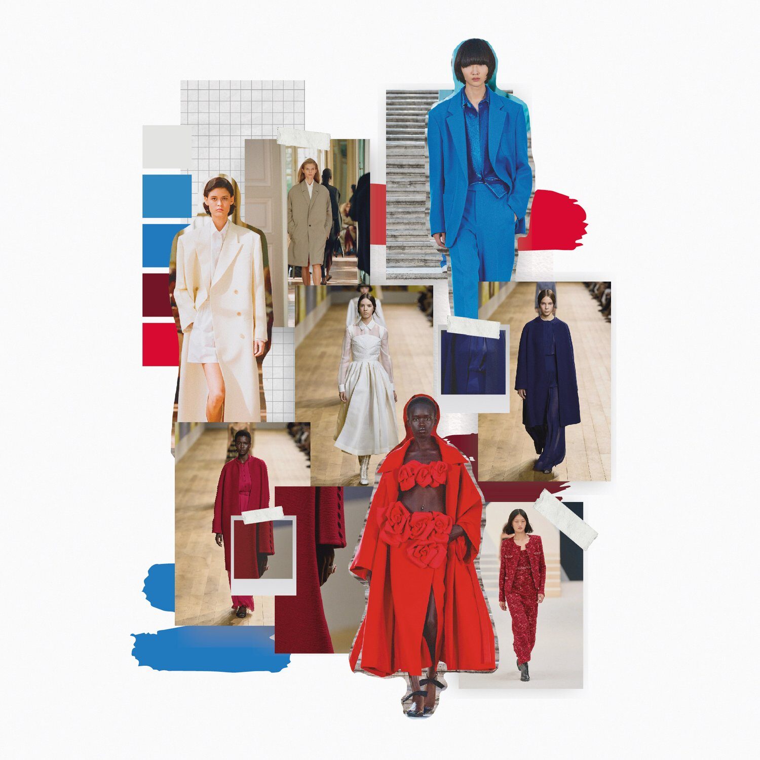
Fashion retailer surveys consistently show that 68 percent of shoppers avoid pattern mixing entirely. They buy printed pieces but never wear them together, convinced that combining patterns requires innate talent they don’t possess. This caution keeps wardrobes boring and leaves beautiful pieces unworn. Meanwhile, designers from Dries Van Noten to Gucci build entire collections around bold pattern combinations that look effortlessly sophisticated. Pattern mixing isn’t random. It follows specific principles that anyone can learn. Once you understand these techniques, you’ll see opportunities everywhere—turning basic striped shirts and floral skirts into outfits that communicate confidence and style knowledge.
Why Your Brain Fights Pattern Mixing
The human brain processes patterns through distinct neural pathways. When you see stripes, your left brain activates—the analytical side that seeks order and structure. Floral prints activate your right brain—the creative side that processes organic, flowing information. Wearing both simultaneously forces your brain to engage both processing systems at once, creating cognitive tension. This tension explains why pattern mixing feels uncomfortable even when it looks objectively good. Your brain struggles to establish visual hierarchy when multiple patterns compete for attention.
Understanding this neuroscience makes you better at pattern mixing. The goal isn’t eliminating cognitive tension—it’s managing it strategically. Successful pattern combinations create enough visual interest to engage the eye without overwhelming the brain’s processing capacity. Think of it like music: a single instrument playing one note is boring. An orchestra with every instrument playing different melodies simultaneously is chaos. Beautiful music happens when instruments play different parts that harmonize. Patterns work the same way.
This is why some pattern combinations instantly feel wrong while others work beautifully—even when both technically break traditional rules. A bold floral dress with a strong geometric print jacket might look terrible because both patterns demand equal attention. The same floral dress with a subtle pinstripe blazer works because the stripe acts as supporting texture rather than competing pattern. Start noticing pattern hierarchy in professional styling. Fashion editorials always establish one dominant pattern with others playing secondary roles. Apply this immediately: when mixing patterns, choose one bold piece and pair it with quieter prints that complement rather than compete.
The Scale Variation Secret
Pattern scale determines whether your outfit reads as intentional or accidental. Combining patterns of identical scale creates visual confusion because your eye can’t distinguish which deserves focus. Small polka dots with small florals look busy and unfocused. Large checks with large stripes overwhelm. The solution involves deliberate scale variation: pair large-scale prints with small-scale patterns to create clear visual distinction.
This technique works across all pattern types. A bold, oversized floral pairs beautifully with fine pinstripes because the scale difference creates natural hierarchy. Large gingham checks work with tiny polka dots. Chunky cable-knit texture combines well with delicate lace because texture functions as pattern—the principle applies even when one “pattern” is actually fabric texture rather than print. Your eye reads these combinations as balanced because it can easily distinguish between the patterns rather than struggling to process competing visual information of similar weight.
- Bold graphic print + fine stripe or check
- Large floral + small geometric
- Chunky texture + delicate print
- Abstract large-scale + structured small-scale
Test this in your closet today. Find your boldest print piece—the one you rarely wear because it feels too loud. Now pair it with the most subtle pattern you own: thin stripes, tiny dots, or small checks. The combination probably works better than wearing either piece with solid neutrals because the scale variation creates sophisticated complexity. If you’re still nervous, add a solid piece as a buffer—a cardigan, jacket, or belt in a color pulled from one of the patterns grounds the look while you build confidence.
The Color Thread That Holds Everything Together
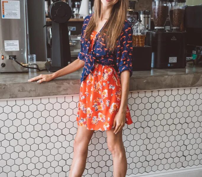
Color creates coherence when patterns differ dramatically. When two or more patterns share at least one common color, your eye can follow that thread through the outfit, making even unlikely combinations feel intentional. A navy striped shirt with a floral skirt containing navy in the print reads as coordinated. The same shirt with a floral containing zero navy looks random. This color connection doesn’t require matching exactly—it requires visible relationship that guides the eye.
The easiest pattern mixing involves keeping patterns within the same tonal range. Dark patterns pair with dark patterns; light with light. A black-and-white geometric print works with a black-and-white floral because the tonal consistency creates unity despite pattern difference. Gradually expand from there: introduce one pattern with multiple colors, then add a second pattern that picks up one of those colors plus one additional shade. This creates a color bridge that connects seemingly disparate elements.
Monochromatic pattern mixing offers the safest entry point. Choose patterns in the same color family but different scales and styles—a large navy floral with thin navy stripes, or various blue patterns from pale to deep navy. The shared color family creates automatic cohesion while the pattern variety adds visual interest without risk. Once you’ve mastered this, try analogous colors (colors next to each other on the color wheel) before attempting complementary combinations. For immediate success, shop your closet for patterns containing similar colors and experiment with pairing them regardless of pattern type. The color connection likely makes combinations work that you’d never have attempted otherwise.
“When patterns share at least one common color, your eye can follow the outfit easily, even if the prints are wildly different”.
Neutral Patterns as Bridge Elements
Certain patterns function as neutrals—they work with almost everything and rarely clash. Stripes, small checks, and subtle dots qualify as pattern neutrals because their simplicity allows them to complement rather than compete with bolder prints. Fashion stylists rely on these bridge patterns to connect pieces that might otherwise clash. A striped shirt isn’t truly a neutral like solid white, but it acts neutrally when paired with most florals, abstracts, or geometric prints.
This transforms how you build a versatile wardrobe. Instead of buying only solid basics, invest in neutral patterns that multiply your options. A good striped tee pairs with solid bottoms, printed skirts, patterned pants, and under printed jackets. It delivers more styling flexibility than a solid tee while adding visual interest to simple outfits. The same applies to small polka dots, fine checks, and subtle pinstripes—they function as pattern neutrals that elevate basic outfits and bridge bolder pattern combinations.
Black-and-white patterns especially act as neutrals. A black-and-white geometric print reads almost as neutral as solid black, making it compatible with nearly any other pattern. Use this strategically: when attempting ambitious pattern mixing, ground one element in black-and-white. A black-and-white stripe with a colorful floral works. A black-and-white polka dot with bright plaid succeeds. The black-white base provides visual anchor that prevents the look from reading as chaotic. Try this immediately: pair your most neutral pattern with the boldest print you own. The neutral pattern will likely balance the bold one better than a solid color would, creating more interesting results with less risk.
The Third Print Technique
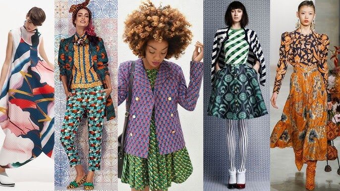
Adding a third pattern sounds counterintuitive when two already feel risky. But a third print often solves pattern mixing problems by creating balance. Two competing patterns fight for dominance. Three patterns establish hierarchy naturally—one leads, two support. Dries Van Noten masters this technique, layering three or four patterns in single outfits that look effortlessly sophisticated rather than chaotic.
The third pattern usually enters through accessories or layering pieces. You’re wearing a floral dress and striped cardigan that almost work but feel slightly off. Add a small polka dot scarf or checked belt and suddenly the outfit coheres. The third pattern creates triangular visual balance that two patterns can’t achieve—your eye travels between three points rather than bouncing between two competing elements. This technique appears constantly in editorial styling but rarely in amateur outfit assembly because it seems too bold. It’s actually safer than stopping at two patterns.
Start experimenting with pattern accessories as your third element. A patterned scarf, printed shoes, or a checked bag adds that third pattern without major commitment. If it doesn’t work, you’ve only added one small piece rather than committing to a full outfit. As you build confidence, try layering printed outerwear over mixed-pattern outfits, or wearing patterned shoes with pattern-mixed clothing. The principle remains consistent: three patterns in varied scales and related colors create sophisticated balance that two patterns often can’t achieve. Pay attention next time you see editorial fashion styling—count the patterns. You’ll frequently find three or more working together harmoniously because stylists understand this triangular balance principle.
Texture as Pattern’s Secret Weapon
Texture functions as pattern even when no print exists. Cable knit, ribbed fabric, lace, quilting, pleating, and bouclé all create visual pattern through dimensional texture rather than printed design. This expands pattern mixing dramatically because textural patterns work with printed patterns using the same principles: scale variation, color connection, and visual hierarchy. A chunky cable knit sweater paired with a delicate floral skirt mixes “patterns” through texture contrast.
Texture mixing often feels safer than print mixing because it’s more subtle. The patterns exist through dimension and light play rather than bold graphics. This makes texture an excellent entry point for pattern-mixing beginners. Pair a silk blouse (smooth texture) with tweed pants (nubby texture). Combine a leather jacket (sleek texture) with a lace dress (delicate texture). These combinations create visual interest through texture contrast while remaining approachable. Your eye reads complexity without the boldness of mixed prints.
- Heavy/structured textures (leather, wool, denim) balance light/flowy fabrics (silk, chiffon, cotton)
- Rough textures (tweed, bouclé) complement smooth textures (satin, jersey)
- Chunky knits pair beautifully with sleek materials (leather, silk, satin)
- Keep color palette cohesive when mixing multiple textures
Advanced pattern mixing layers textural patterns with printed patterns. Dries Van Noten frequently combines silky printed pants with crisp poplin shirts—mixing print with texture to create sophisticated complexity. Once you’ve mastered basic texture mixing, try combining one textural “pattern” with one printed pattern: a chunky knit with a printed skirt, or a quilted jacket over a striped dress. This achieves visual interest through multiple pattern types while maintaining approachability because texture feels less bold than competing prints. Audit your closet for textural pieces you’ve been treating as solids—knitwear, lace, leather, quilted items—and start pairing them intentionally with both prints and other textures.
Pattern Mixing Across Occasions
Pattern mixing techniques adapt to every style context. For conservative professional environments, keep patterns subtle: fine stripes with small checks, tonal prints in similar color families, or textural patterns with minimal printed patterns. The techniques remain identical—scale variation, color connection, visual hierarchy—but the boldness level adjusts to context. A thin-striped shirt with a subtle plaid blazer applies pattern mixing principles while maintaining professional conservatism.
Casual settings allow bolder experimentation. Mix large florals with bold stripes. Combine geometric prints with abstract patterns. Layer three or four patterns if they follow the scale and color principles. Casual contexts forgive pattern mixing mistakes better than formal ones, making everyday dressing ideal for building skills. Start bold in weekend wear where stakes feel lower. As techniques become natural, transfer them to professional dressing with adjusted intensity.
Evening and formal wear benefit enormously from sophisticated pattern mixing. A printed dress with a textured jacket creates far more visual interest than solid evening wear. Patterned accessories—a brocade clutch, jacquard shoes, or printed shawl—elevate simple dresses without the commitment of fully patterned formal wear. The same principles apply regardless of occasion: one pattern leads, others support; scale varies to create hierarchy; color threads connect disparate elements. Context only adjusts how boldly you apply these unchanging fundamentals. Practice pattern mixing in low-stakes situations first, then gradually introduce techniques to more formal settings as confidence builds.
Building a Pattern-Mixing Wardrobe
Strategic shopping transforms pattern mixing from occasional experiment to daily practice. Instead of acquiring random prints, build a pattern wardrobe with intention. Start with neutral patterns—stripes, small checks, subtle dots—in your most-worn colors. These function as bridges between bolder pieces while working beautifully with solids. Add 2-3 statement prints in varied scales: one large-scale bold print, one medium-scale pattern, one small delicate print. Ensure these statement prints share at least one color to maximize mixing potential.
Consider color palette cohesion across your pattern pieces. If most of your wardrobe lives in cool-toned blues and grays, choose patterns featuring those colors even when they include warm accents. This doesn’t mean matching everything perfectly—it means creating color relationships that allow pieces to work together naturally. A floral with predominantly blue flowers and green leaves mixes better with your blue-based wardrobe than a floral featuring orange and pink, even if both are equally beautiful.
Accessories provide low-commitment pattern mixing practice. A patterned scarf, printed shoes, or checked bag adds pattern dimension without the investment of clothing pieces. Use accessories to test pattern combinations before committing to full outfits. If a striped scarf looks great with your floral dress, you’ll probably love a striped top with that dress too. Accessories teach you which pattern combinations suit your eye and build confidence for bigger mixing decisions. Start today: add one patterned accessory to an outfit you’d normally wear with solid accessories. Notice how it changes the outfit’s sophistication level with minimal effort.

Which pattern combination surprised you most? Share the mix you never thought would work but absolutely does.