Color speaks before you even open your mouth. In a world where first impressions form in milliseconds, understanding the psychology and strategic application of color in fashion has become more crucial than ever. This isn’t about following seasonal color palettes—it’s about wielding color as a tool for confidence, communication, and personal brand building.
The Color Revolution
In 2025, color isn’t just aesthetic—it’s strategic communication.
Beyond the Seasonal Palette: The Science of Color Psychology
Traditional color analysis focused on skin undertones and seasonal palettes. While these remain relevant, modern color strategy goes deeper. We’re now understanding how different hues affect mood, perception, and even performance.
Recent studies in chromotherapy show that wearing certain colors can actually influence your mental state. Red increases confidence and energy. Blue promotes calm focus. Green enhances creativity and balance. This isn’t fashion folklore—it’s science.
The key lies in understanding not just what colors look good on you, but what emotional and psychological impact you want to create.
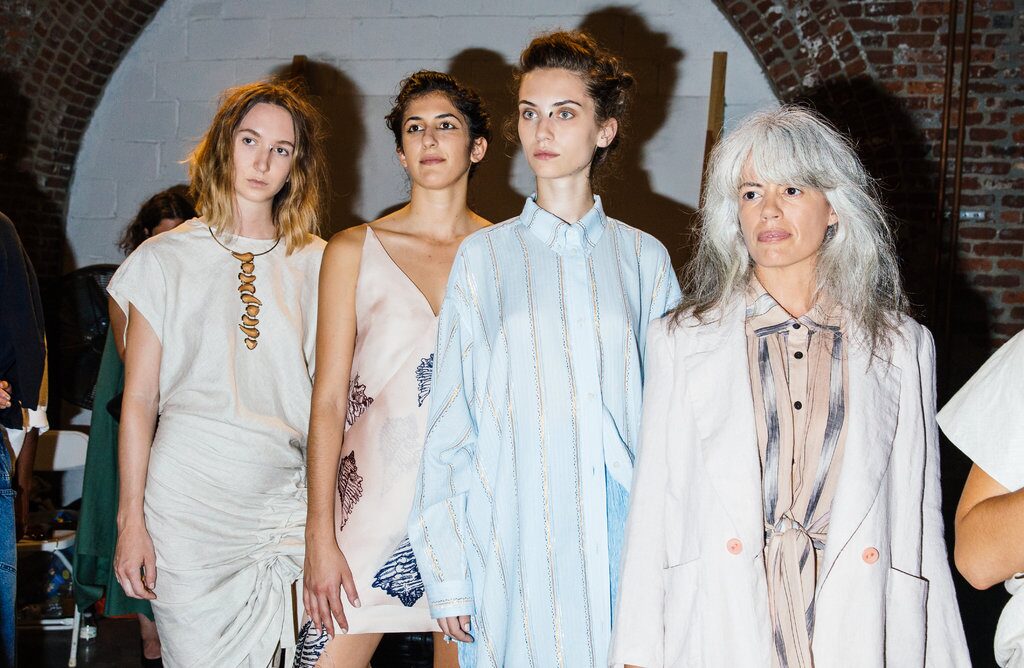
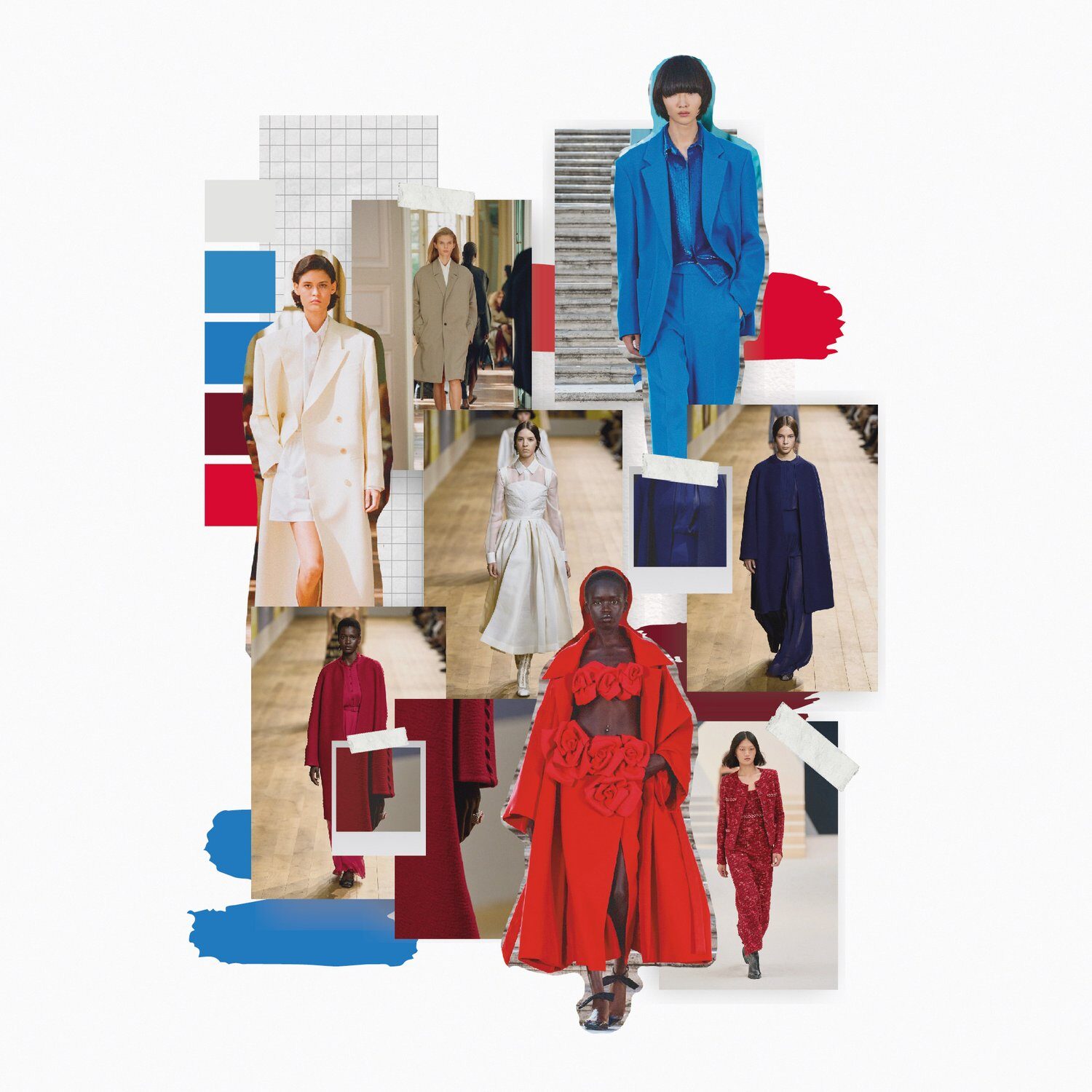
The Power Player’s Palette: Strategic Color Choices
Red: The Confidence Catalyst
Red remains fashion’s most powerful color. But 2025’s approach to red is more sophisticated than ever. We’re seeing the rise of “quiet reds”—deeper, more complex shades that command attention without screaming.
Think Bottega Veneta’s signature brick red or Saint Laurent’s deep burgundy. These shades offer red’s psychological benefits while maintaining elegance and versatility.
When wearing red, consider the message you’re sending. A red blazer in a meeting signals confidence and leadership. A red dress on a date suggests passion and energy. The key is intentional application.
Blue: The Trust Builder
Blue has evolved from corporate staple to sophisticated power color. Navy blue specifically has become the new black—offering similar versatility with added psychological impact.
Blue triggers feelings of trust, stability, and competence. It’s why tech executives favor blue suits and why blue is prevalent in financial sector branding. In fashion, blue works because it’s both approachable and authoritative.
The trick is choosing the right shade. Cobalt blue makes a statement. Powder blue feels approachable. Navy blue projects competence. Each serves a different strategic purpose.
The Unexpected Heroes: Colors That Changed the Game
Green: The Creativity Catalyst
Green has shed its association with nature-lover stereotypes to become 2025’s most surprising power color. From Gucci’s signature sage to Hermès’ forest green, luxury brands are embracing green as a symbol of growth, renewal, and innovation.
Psychologically, green enhances creativity and reduces eye strain. It’s why many creative professionals are gravitating toward green workwear. A green blazer or dress can signal innovation and fresh thinking.
Purple: The Luxury Indicator
Purple’s historical association with royalty translates perfectly to modern luxury communication. Deep plum, rich violet, and sophisticated lavender all signal creativity, luxury, and independent thinking.
Purple works particularly well in creative industries where conventional navy and black might feel too conservative. It’s sophisticated enough for serious business while creative enough to stand out.
Color Strategy Insight
The most effective color choices align with your personal brand and professional goals. Consider the psychological impact you want to create, not just aesthetic appeal.
Mastering Color Combinations: The Art of Sophisticated Pairing
Monochromatic Mastery
Monochromatic dressing has become the ultimate sophistication signal. But executing monochromatic looks requires understanding texture, tone, and proportion.
The key is variation within similarity. A navy silk blouse with navy wool trousers and navy leather accessories creates depth through texture contrast while maintaining color unity.
Consider different finishes within the same color family. Matte and shine, smooth and textured, light and dark variations of the same hue create visual interest without color clash.
Complementary Confidence
Complementary colors—those opposite on the color wheel—create dynamic, confident looks when handled correctly. Think navy and camel, burgundy and forest green, or purple and gold.
The secret is proportion. Use one color as the dominant shade and the other as an accent. A camel coat over a navy dress, or burgundy accessories with a forest green outfit.

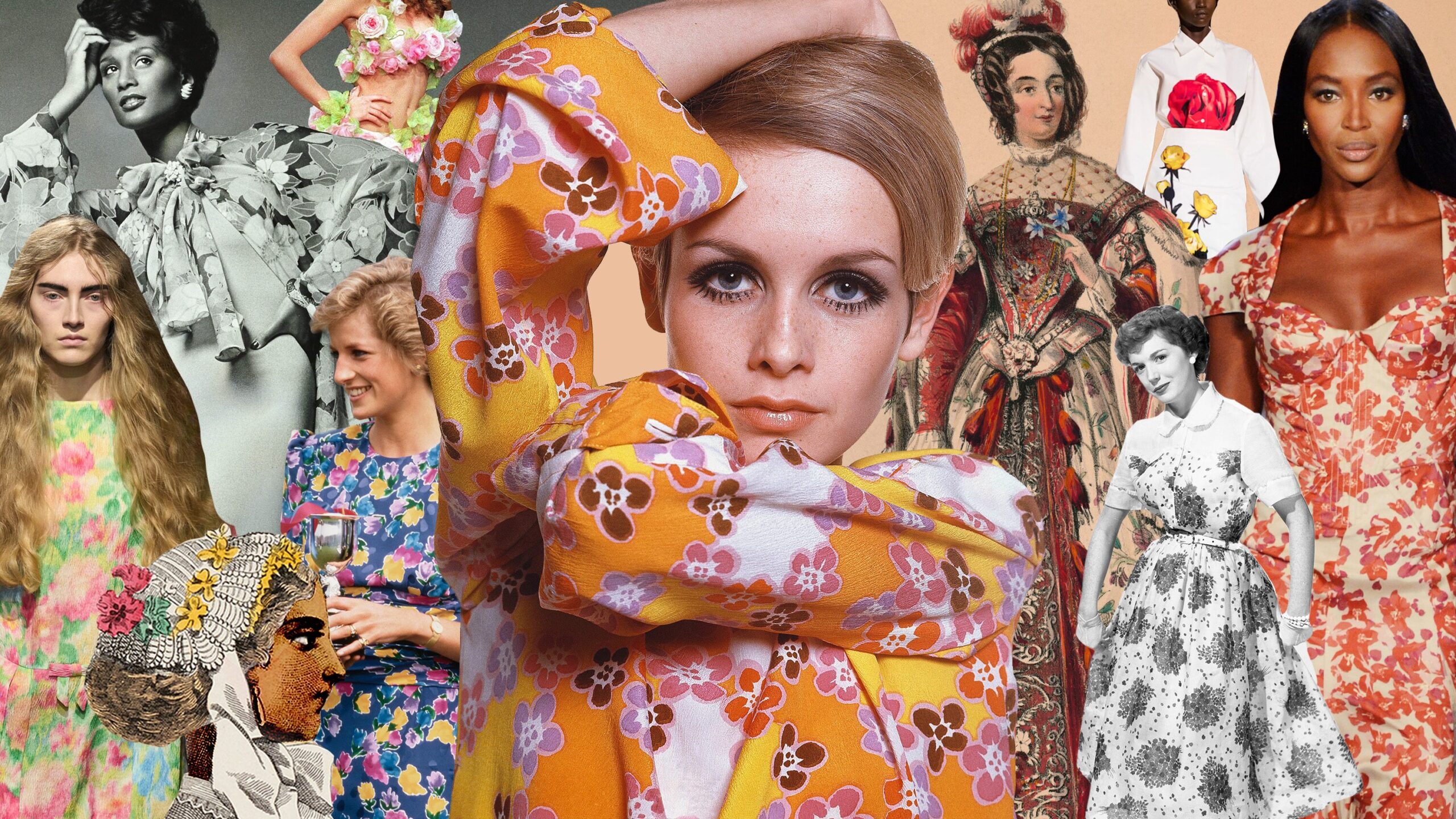
The Seasonal Color Evolution: Modern Approaches to Traditional Concepts
Spring: Beyond Pastels
Spring color palettes have evolved beyond traditional pastels. 2025’s spring colors include sophisticated corals, intelligent greens, and complex yellows that work in professional settings.
The modern approach combines spring’s fresh energy with year-round wearability. A sophisticated coral blazer or intelligent sage green dress can work from March through November.
Summer: Elevated Brights
Summer colors now include elevated brights—saturated hues that maintain sophistication. Think royal blue instead of electric blue, deep coral instead of hot pink.
These colors offer summer’s energy while maintaining professional credibility. They work equally well in boardrooms and beach clubs.
Fall: Warm Complexity
Fall colors have embraced complexity. Instead of basic browns and oranges, we’re seeing rich cognacs, sophisticated rusts, and intelligent olives.
These colors offer warmth without sacrificing sophistication. They’re perfect for transitional seasons and work beautifully in professional environments.
Winter: Beyond Black and White
Winter palettes now include rich jewel tones alongside traditional neutrals. Deep emerald, rich burgundy, and sophisticated navy offer winter’s intensity with added personality.
These colors work particularly well for holiday events and winter professional wear. They’re dramatic enough for special occasions while maintaining everyday wearability.
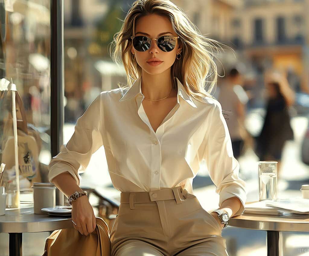
The Neutral Revolution: Elevated Basics
Beige: The New Black
Beige has undergone a complete transformation. From boring basic to sophisticated neutral, beige now includes complex shades like mushroom, oatmeal, and warm taupe.
These elevated beiges offer neutrality with personality. They work as wardrobe foundations while adding subtle sophistication.
Gray: The Thinking Person’s Neutral
Gray has evolved beyond basic charcoal to include sophisticated variations like dove gray, warm greige, and soft pewter.
These grays offer neutrality with intelligence. They’re perfect for professional settings where you want to appear thoughtful and sophisticated.
Color and Skin Tone: The Modern Approach
Understanding Undertones
Modern color analysis goes beyond seasonal categories to understand individual undertones. Cool undertones benefit from blues, purples, and true reds. Warm undertones shine in oranges, yellows, and warm reds.
But the key is understanding that these are guidelines, not rules. Confidence and styling can make almost any color work.
The Test Method
Hold different colored fabrics near your face in natural light. Notice which colors make your skin look brighter and which make it look dull. This simple test reveals more than complex color analysis systems.
Trust your instincts. If a color makes you feel confident and attractive, it’s probably working for you.
Practical Application: Building Your Strategic Color Wardrobe
The Foundation Colors
Start with three foundation colors that work with your skin tone and lifestyle. These should be colors you can mix and match easily.
Common foundation combinations include navy, white, and camel, or black, gray, and cream. These provide the base for building more complex color combinations.
The Accent Colors
Choose 2-3 accent colors that complement your foundation palette. These should be colors that make you feel confident and align with your personal brand.
Consider your professional needs. If you work in a conservative industry, choose sophisticated accent colors. If you’re in a creative field, you can be more adventurous.
The Statement Colors
Every wardrobe needs 1-2 statement colors—hues that make you feel powerful and confident. These are colors you reach for when you want to make an impression.
Statement colors should align with your personality and professional goals. They’re your signature colors—the ones people remember you wearing.
Your Strategic Color Action Plan
- Identify your psychological color goals (confidence, creativity, trust)
- Test colors against your skin tone in natural light
- Choose 3 foundation colors for your wardrobe base
- Select 2-3 accent colors that complement your foundations
- Identify 1-2 statement colors that make you feel powerful
- Practice monochromatic and complementary combinations
The Future of Color: Trends to Watch
Digital Color Matching
Technology is revolutionizing color selection. Apps can now analyze your skin tone and suggest optimal color palettes. While not perfect, these tools provide useful starting points.
Sustainable Color Choices
Sustainability is influencing color trends. Natural dyes and eco-friendly processes are creating new color palettes focused on earth tones and organic hues.
Cultural Color Influences
Global fashion influences are expanding color palettes. Colors traditionally associated with specific cultures are being reinterpreted in modern contexts.
The Psychology of Professional Color Choices
Industry-Specific Color Strategies
Different industries have different color expectations. Finance favors navy and gray. Creative industries embrace more colorful palettes. Technology companies often prefer clean, modern colors.
Understanding these unwritten rules helps you make strategic color choices that align with professional expectations while expressing your personality.
Meeting Your Color Objectives
Every color choice should serve a purpose. Are you trying to project authority? Choose deeper, richer colors. Want to appear approachable? Opt for softer, warmer hues.
Consider the context. A red dress might be perfect for a networking event but inappropriate for a conservative client meeting.
Color Confidence: The Ultimate Accessory
The most important aspect of color strategy is confidence. When you understand how colors affect perception and mood, you can use them strategically to achieve your goals.
Color isn’t about following rules—it’s about understanding them well enough to use them effectively. The most stylish people aren’t those who follow color trends blindly, but those who understand how to use color to communicate who they are and what they want to achieve.
Your color choices tell a story about your personality, professionalism, and goals. Make sure that story is the one you want to tell.
In 2025, color literacy is a crucial skill. Master it, and you’ll have a powerful tool for personal and professional success.